Microsoft XBOX 360 (Blades)
Background
In the early 2000s, Microsoft set out to redefine the gaming console experience, not just through hardware, but with a bold, immersive user interface. The Xbox 360 needed a UI that felt fast, fun, and futuristic, something that could scale with the console’s evolving digital ecosystem.
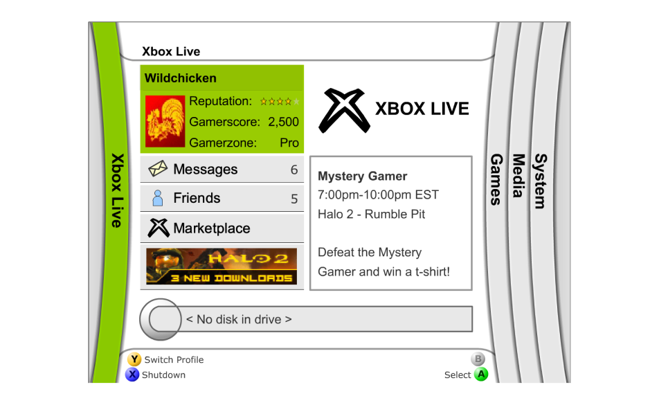
The Xbox 360 Blades Dashboard was more than a user interface; it was a watershed moment in gaming history. Its horizontally scrolling, color-coded interface made navigating with a controller easy and quick. Each blade was purpose-built, clearly labeled, and visually distinct, resulting in a sense of flow that modern dashboards oftenly lack. It was innovative, fast, and streamlined.
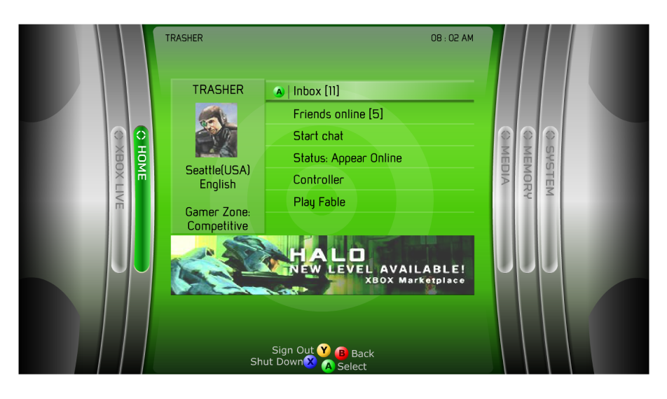
Hi-Fi Mockup by Ton Hanchai
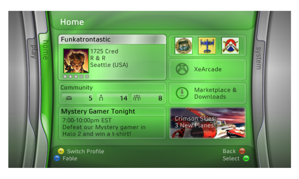
Final Shipped Product
On a personal note, this design team was one of the best teams I’ve ever been part of. The people were awesome, the energy was great, and we knew how to work hard and have fun doing it. Big shoutout to all my amazing teammates, you made it unforgettable! 🙂
Category
Game Console Design · Real-Time Multiplayer Experiences · Interactive Gameplay · Gaming Innovation
Role
As the UX/UI Rapid Prototyper, I was responsible for building interactive prototypes, from low to high-fidelity, using Flash and ActionScript. These prototypes were used to test navigation models, pitch concepts to leadership, and guide engineering implementation.
Tool
Macromedia Flash, ActionScript 2.0, Photoshop, Xbox Dev System.
The Problem
Designing for a game controller isn’t like designing for a mouse or touchscreen. During early development of the Xbox 360 Dashboard, we needed to ensure users could intuitively navigate the interface using only a D-pad and a few buttons. The challenge: how do we make sure players can quickly find what they need without frustration or guesswork?
The Approach
We built a series of interactive prototypes using Flash and ActionScript to simulate real-time navigation. What made it extra cool? Users tested the interface using an actual Xbox game controller just like they would at home. The controller was wired to work directly with the prototype, so we could see exactly how people moved through the dashboard, where they paused, and what tripped them up.
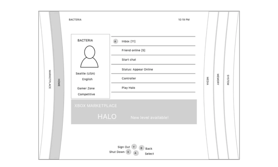
Lo-Fi Wireframe
Mid-Fi Wireframe
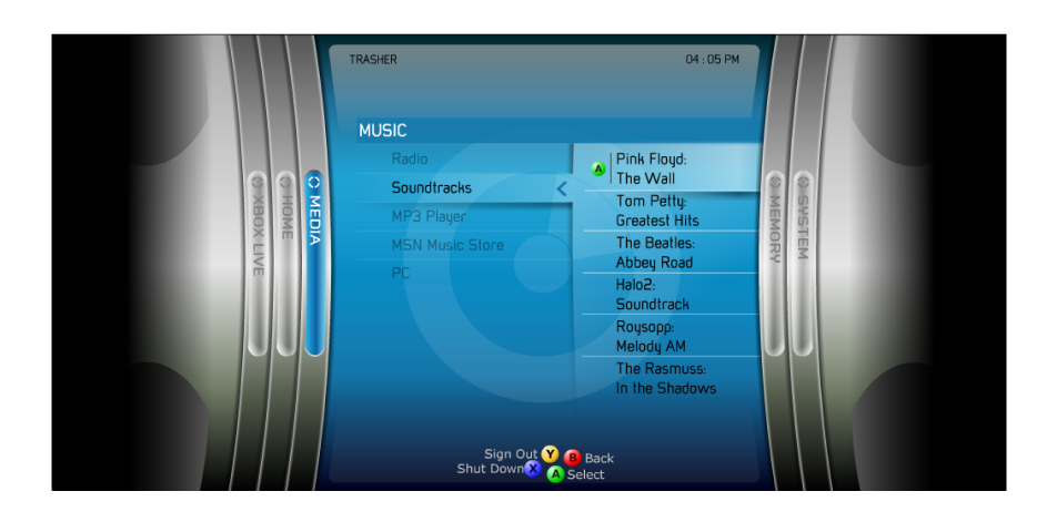
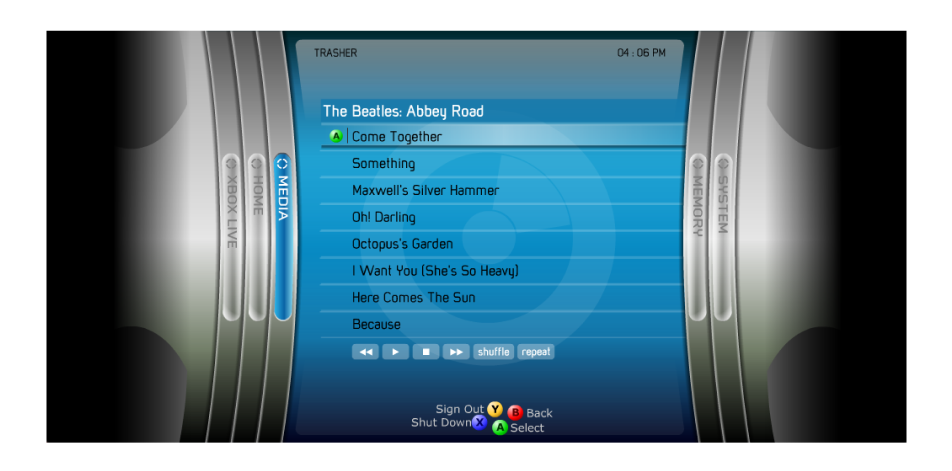
Hi-Fi Interactive Prototype - Blades Dashboard by Ton Hanchai
The Prototype
One of my primary responsibilities was to develop a working prototype for the Media section.
The objective? To see if users could easily find and play a music track they had recently uploaded from a CD and saved as an MP3 on their Xbox 360 console. Using the actual Xbox controller, allowing users to navigate just like they would on a real console. During testing, we observed how they navigated the Home and Media sections, looking for any signs of confusion or hesitation. After a few iterations, we refined the flow and layout, making it faster and more intuitive. As a result, users could easily find and play their music, confirming that the experience was natural and satisfying.
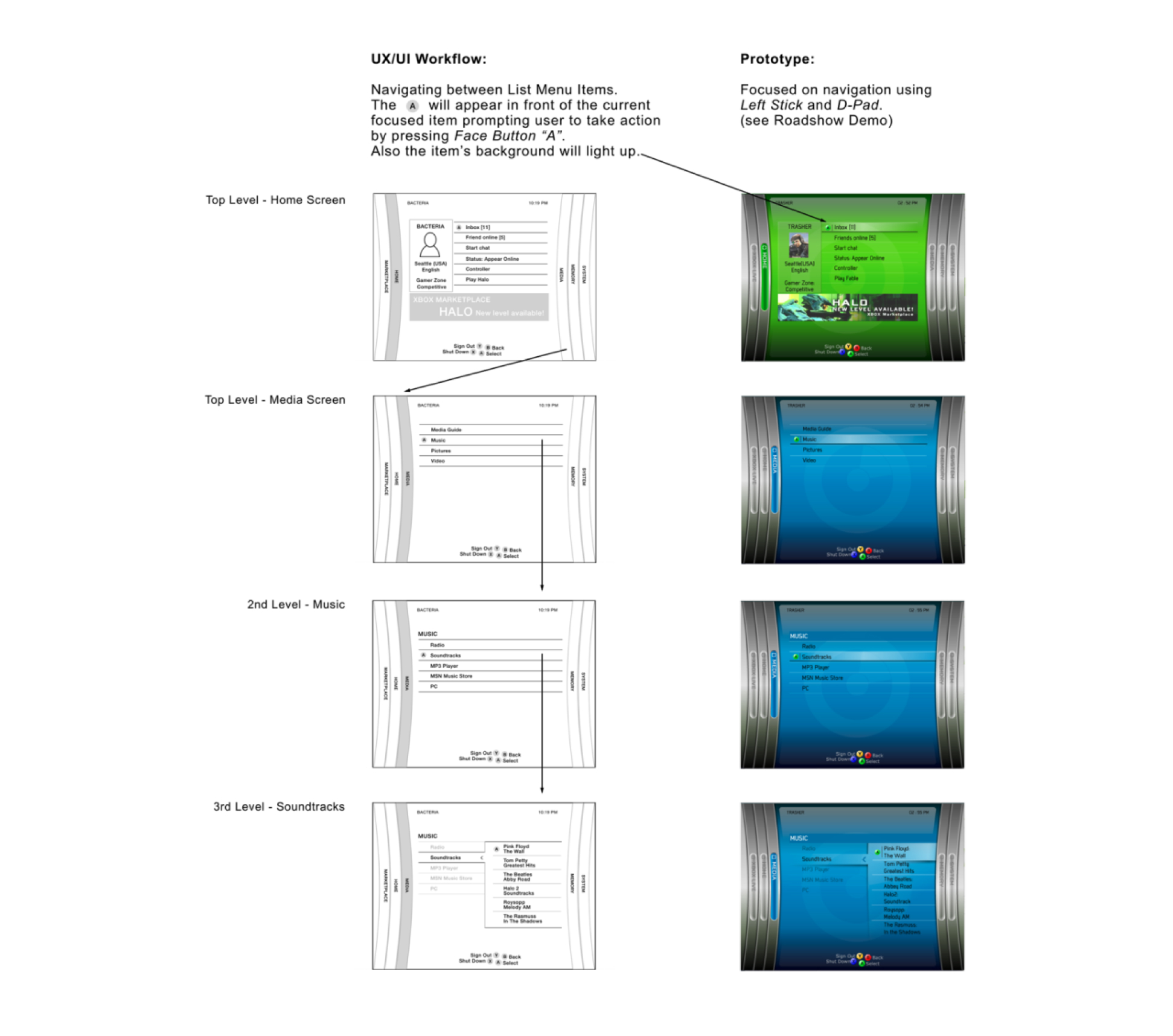
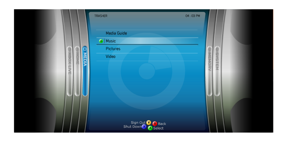
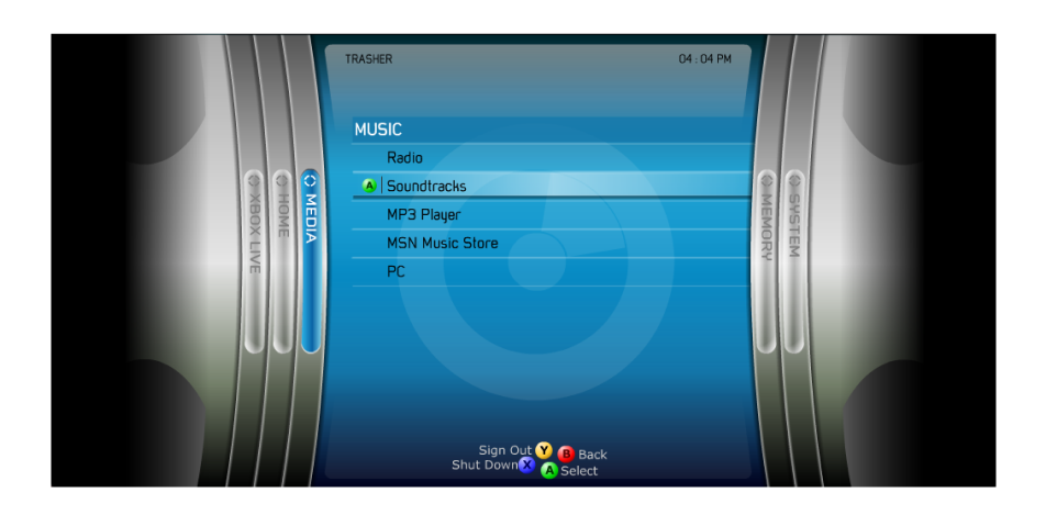
Hi-Fi Interactive Prototype - Media Blade by Ton Hanchai
A Meaningful Iteration
Early concepts leaned heavily on vertical navigation. Through testing, we discovered horizontal scrolling better aligned with controller ergonomics and visual memory—leading to the now-famous Blades layout.
Measurable Impact
- Microsoft described the Xbox 360 launch lineup as the “strongest in the history of video game consoles”, with 18 games and 13 accessories available on day one (source)
- The console sold out completely at launch, with over 325,000 units sold in the U.S. in November 2005 alone, despite supply shortages (source)
- It was the first console to launch nearly simultaneously across major global regions, a bold move that helped Microsoft gain a head start over Sony and Nintendo (source)
- The Blades UI became a cultural touchpoint for a generation of gamers (source)
Final Result
The Blades Dashboard, a horizontally scrolling interface that became iconic for its simplicity, speed, and style. It launched with the Xbox 360 in November 2005 and set a new standard for console UI. Gamers still remember it fondly, some users still consider it the best Xbox 360 dashboard, praising its speed, lack of ads, and overall aesthetic. It wasn’t just easy to use, it was fun, fast, and unforgettable.
100% best dashboard or console ui really. The themes were also great and varied thanks to the fact that there were so many blades and each could have its own picture. I remember the Halo 3 one, it was sooooo good.
The blades were understandably popular, contributing to the overall aesthetic of the much-beloved Xbox 360, a console juggernaut for Microsoft back in the day. It's easy to see why some long-time Xbox fans would want the feature to return...
Key Insights Takeaway
- Controller-first design requires rethinking traditional UI patterns
- Rapid prototyping accelerates decision-making and stakeholder buy-in
- Team culture directly fuels creative breakthroughs